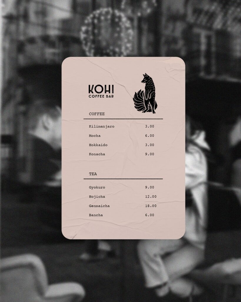
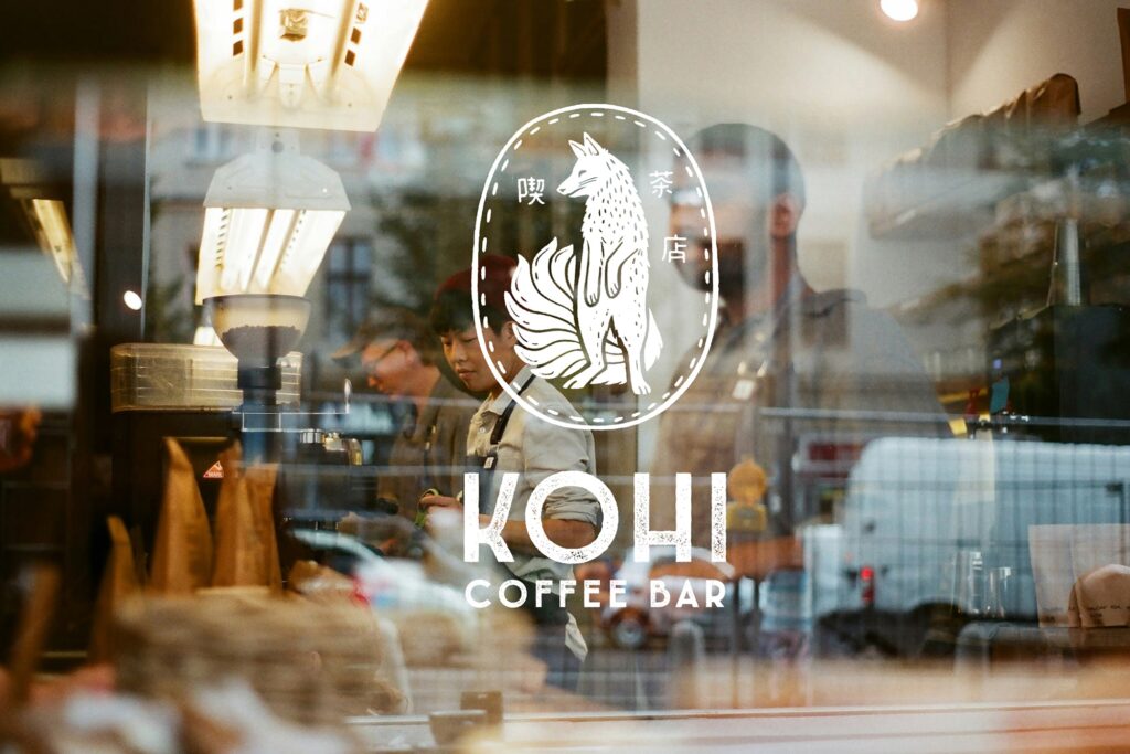
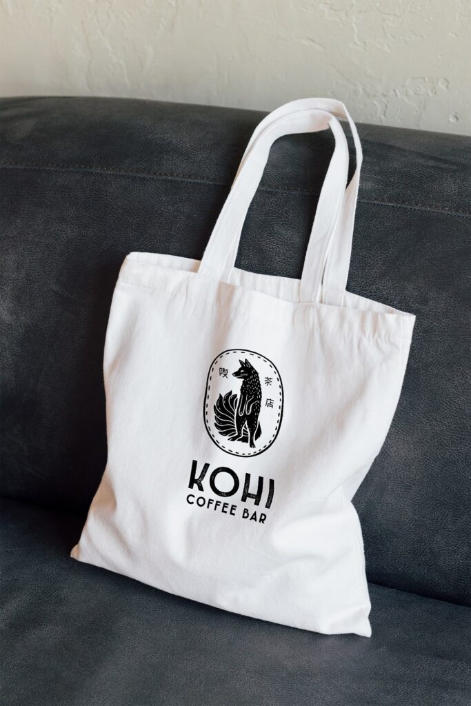
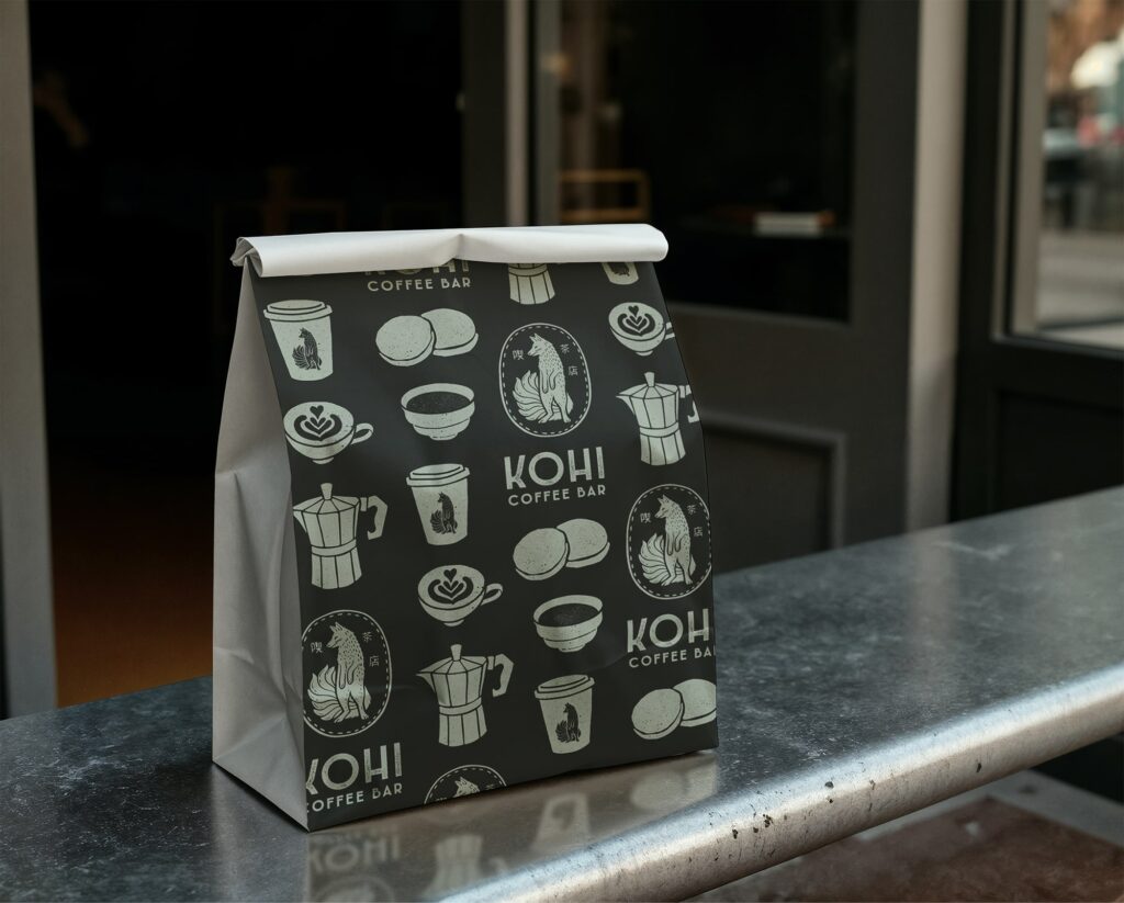
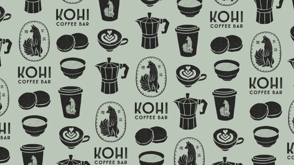
Kohi is a Japanese-inspired slow coffee bar grounded in the ideas of presence, ritual, and quiet connection. The visual identity centers on an illustrated kitsune, a symbol of intuition and gentle guidance, paired with hand-crafted, rustic typography to echo the tactile spirit of the space.
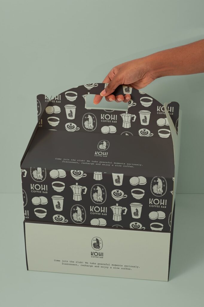
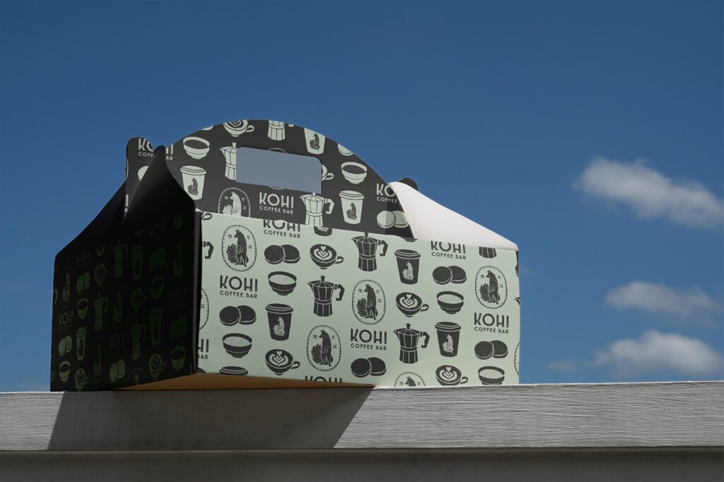
The color palette blends soft aqua chalcedony, deep charcoal, and a warm, understated off-white reminiscent of natural ceramics. Together, these elements create a calm, minimal atmosphere that reflects Kohi’s philosophy. The brand system includes a logo suite, color palette, typography, an icon set, and packaging visual concepts designed to support their future product line.
Why it matters
Kohi needed an identity that invited people to slow down. The blend of symbolism, hand-made elements, and soft tones helps the brand stand apart while capturing the calm, reflective experience they want to create.
Deliverables included
- Logo (illustrated icon + wordmark)
- Fonts and hierarchies
- Color palette
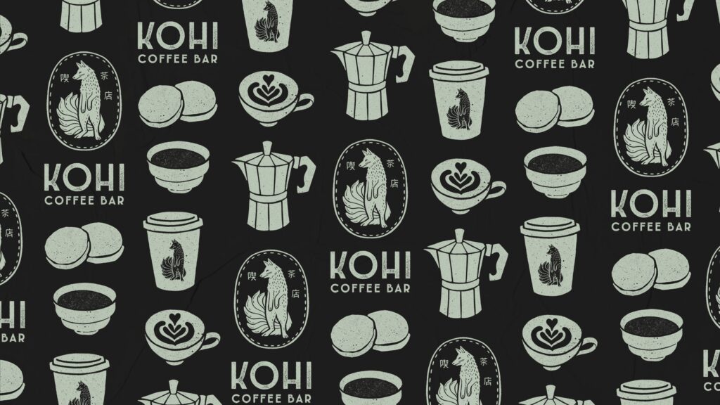
- Icon set + surface pattern
- Packaging mockups guiding the brand’s visual direction
- Style-sheet
