Blossom Tea is a brand identity I designed for a tea company rooted in Japanese symbolism and tradition. My goal was to develop a visual language that evokes calmness, presence, and a sense of renewal. The brand draws on the symbolism of the sakura flower (impermanence), the butterfly (transformation), the rising sun (new beginnings), and the mirror (self-reflection). These concepts informed everything from logo design to packaging storytelling.
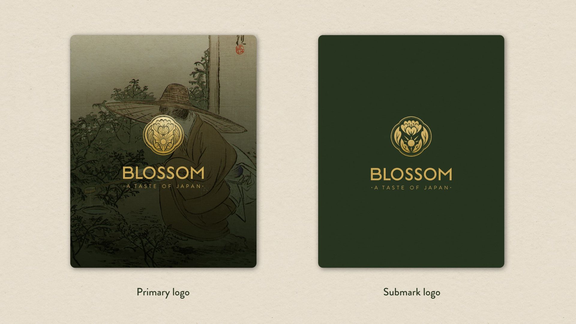
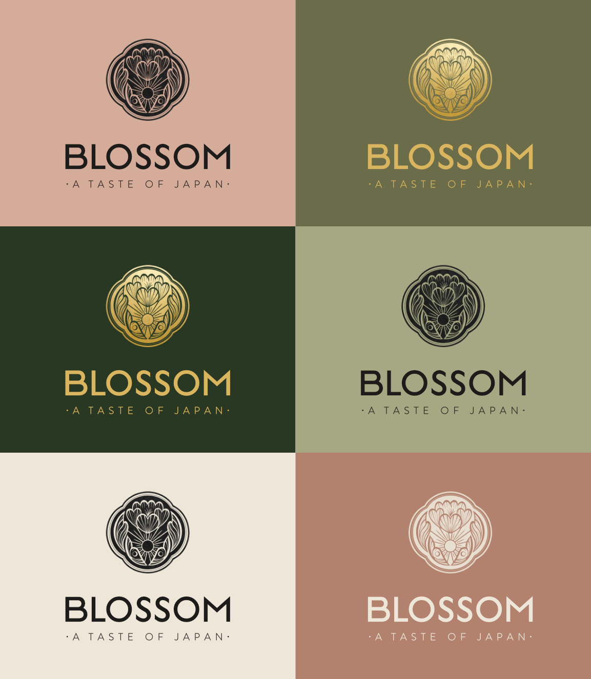
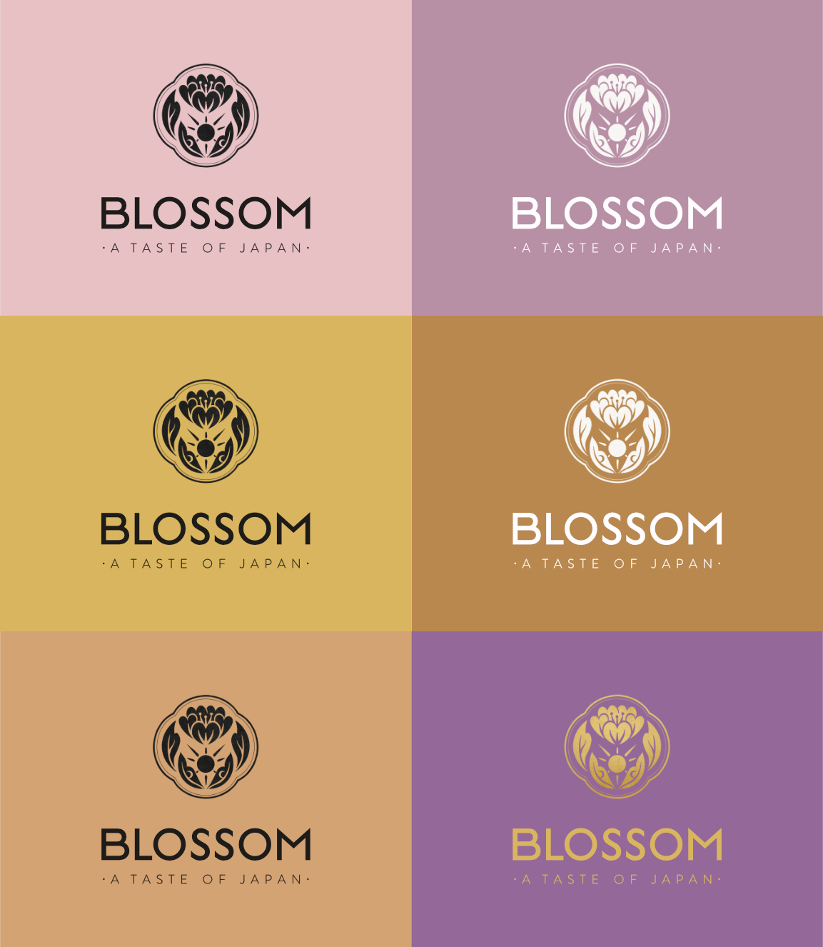
Two logo variations: a detailed icon for larger use and a simplified one for smaller sizes, ensuring consistency and legibility across all touch points. The primary color palette (earthy greens, blush pink, warm brown) conveys natural and earthy tones, while the secondary palette introduces tones for a serene and elegant brand atmosphere.
Why it matters
Blossom Tea needed visual differentiation and cultural authenticity. By incorporating modified Ukiyo-e artwork into its packaging and digital assets, we created a distinct and recognizable look using accessible resources. These visuals were retouched to ensure quality and alignment with the brand’s soft and sophisticated aesthetic.
Deliverables included
- Full primary, secondary, and tertiary logo suite
- Font system and typographic hierarchy
- Color palette and usage combinations (primary and secondary)
- Photography art direction
- Printed promotional materials (posters, cards, thank-you note)
- Instagram templates (posts and stories)
- Curated and retouched photography assets for brand use
- Two box packaging designs
- One paper bag packaging design
- One tote bag design
- Brand identity guidelines (PDF format)