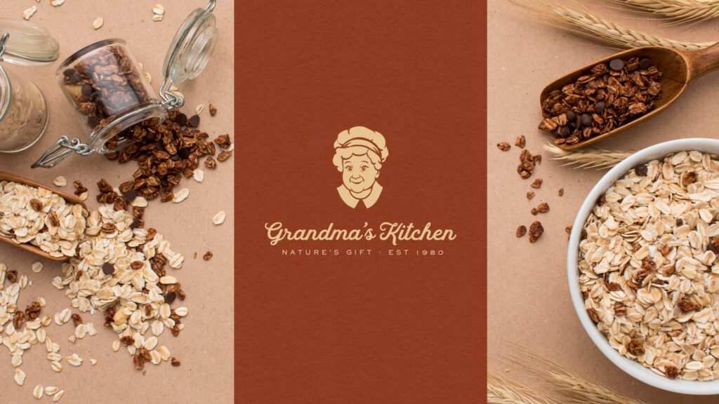
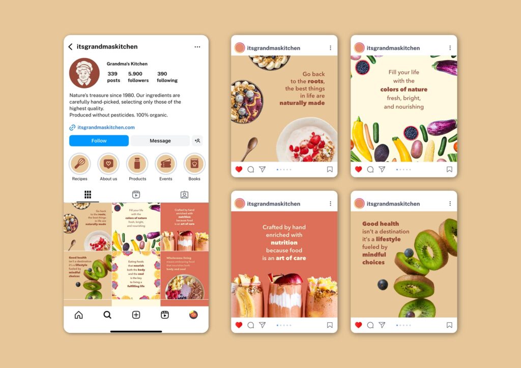
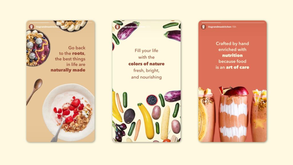
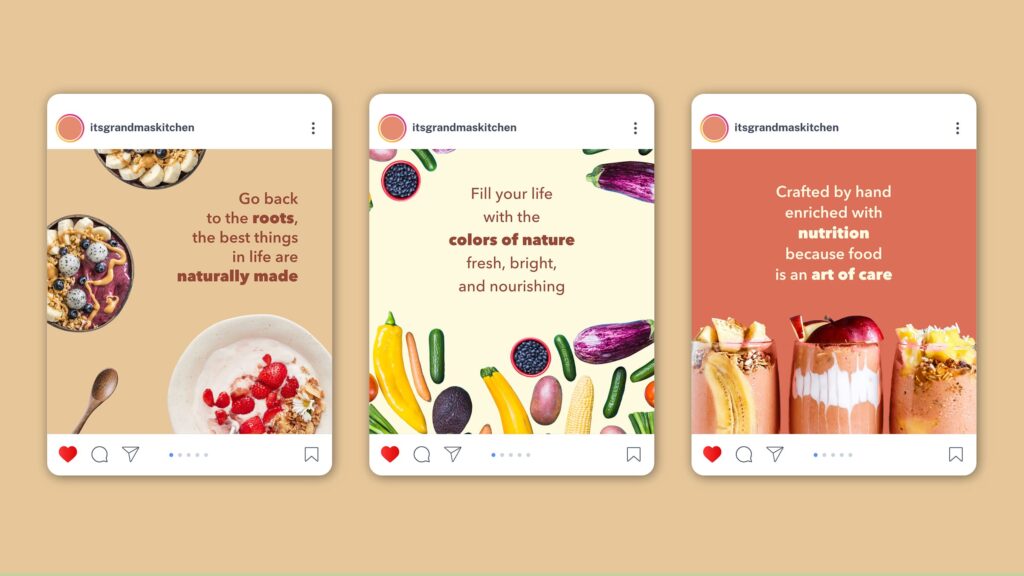
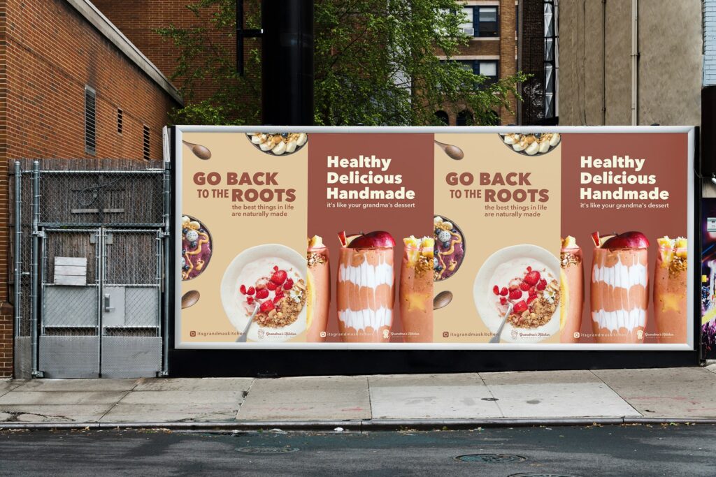
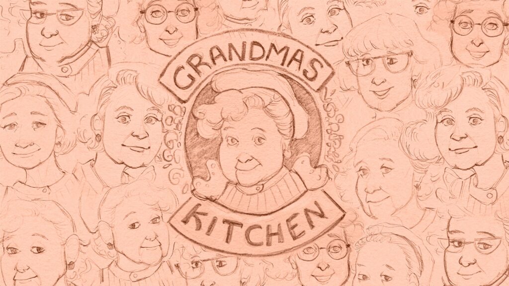
Grandma’s Kitchen is a brand identity I designed for a family-owned food company. The goal was to create a visual language that feels caring, warm, optimistic, and honest, focussed on the comfort of home-cooked meals.
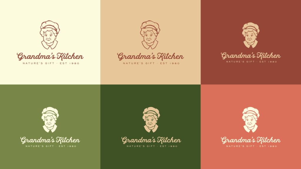
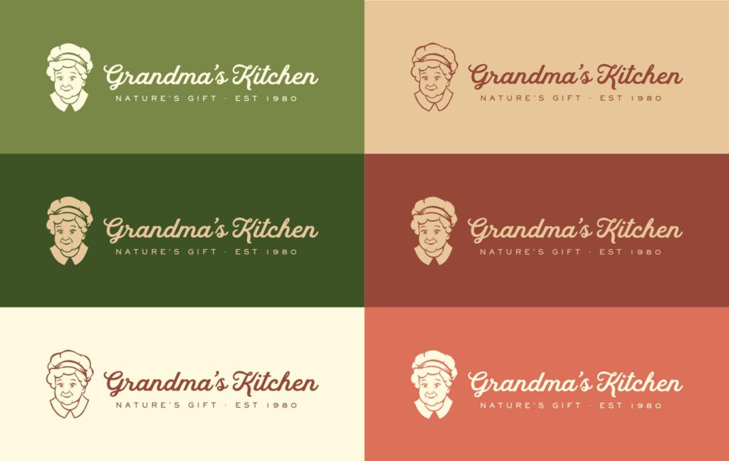
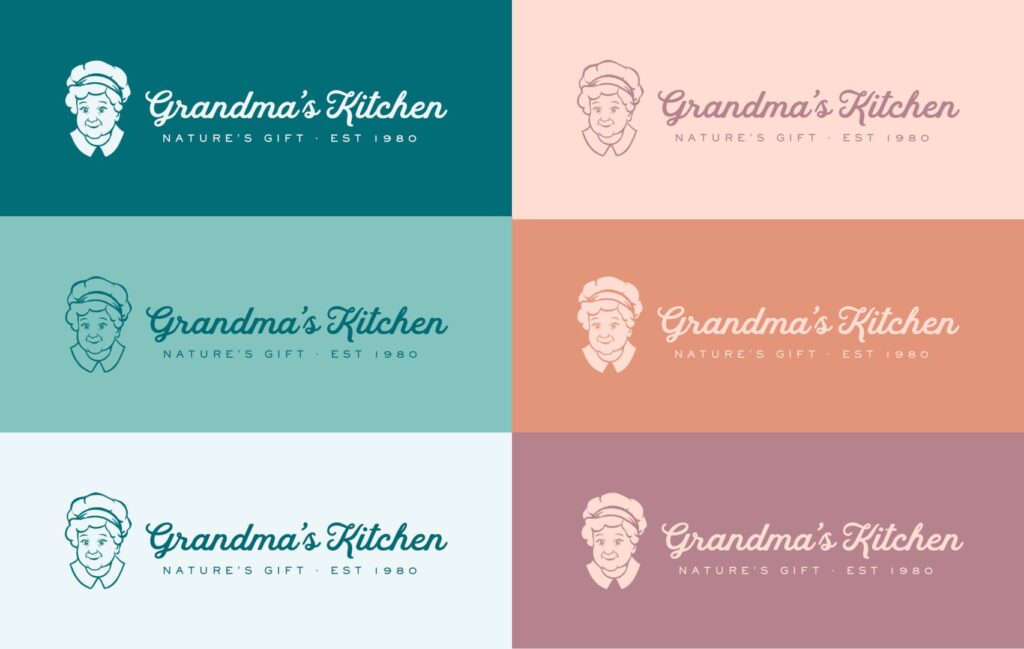
The logo features an illustrated portrait of the founder, paired with a vintage-inspired script typeface to spark familiarity and nostalgia. A warm, earthy primary palette for an organic and homemade feel, while the secondary palette introduces soft, calming tones that suggest care and comfort.
Why it matters
Grandma’s Kitchen needed a brand that would feel personal and heartfelt, something customers who value organic and natural foods could connect with instantly. Through the founder’s portrait, utilizing vintage design language, and following natural colors, the identity creates emotional resonance across all assets while remaining recognizable.
Deliverables included
- Full primary, secondary, and tertiary logo suite
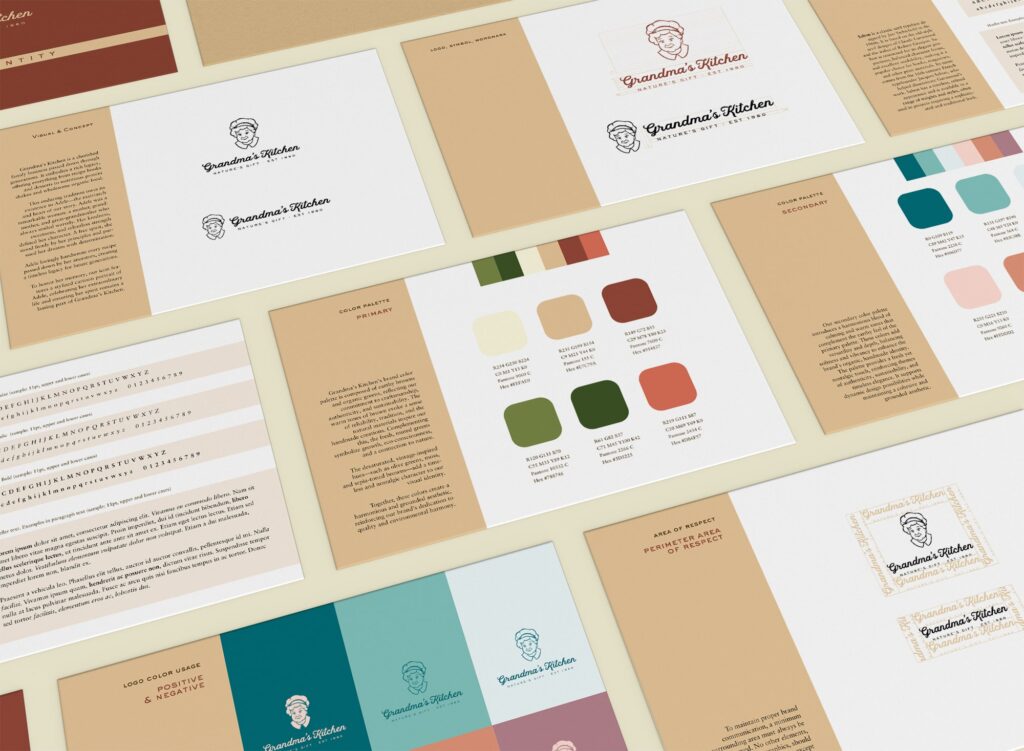
- Font system and typographic hierarchy
- Color palette and usage combinations (primary and secondary)
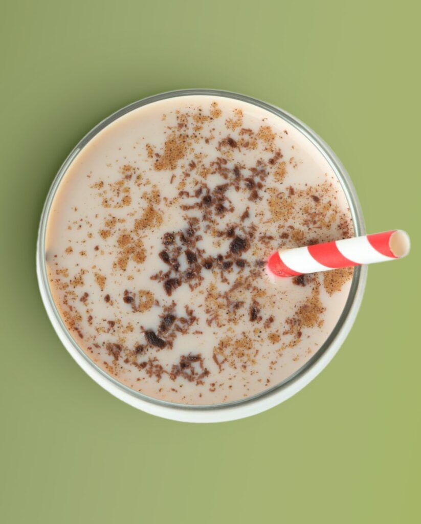
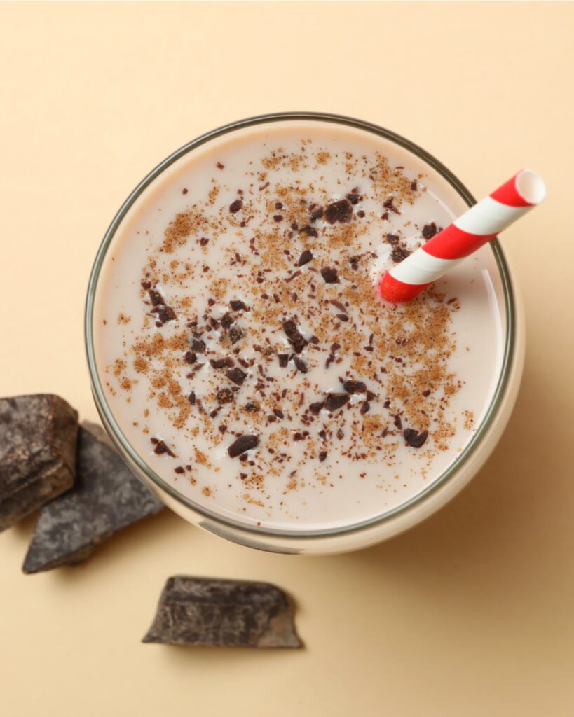
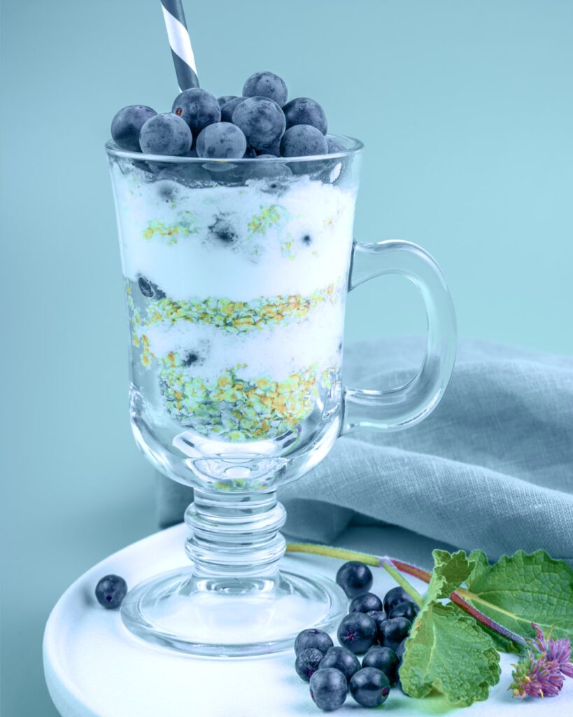
- Photography art direction
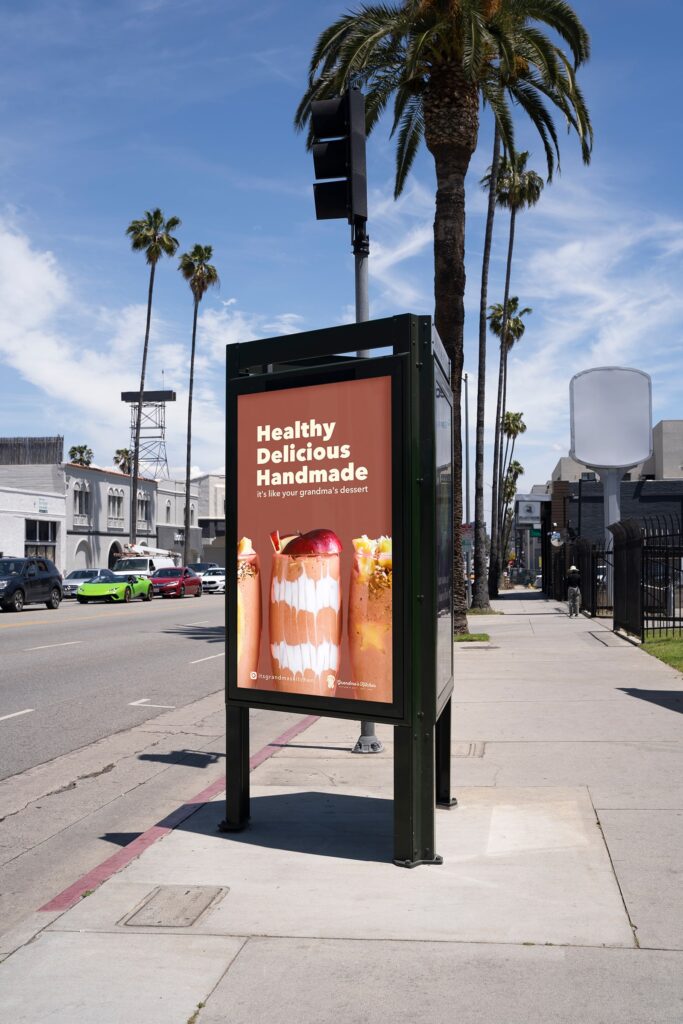
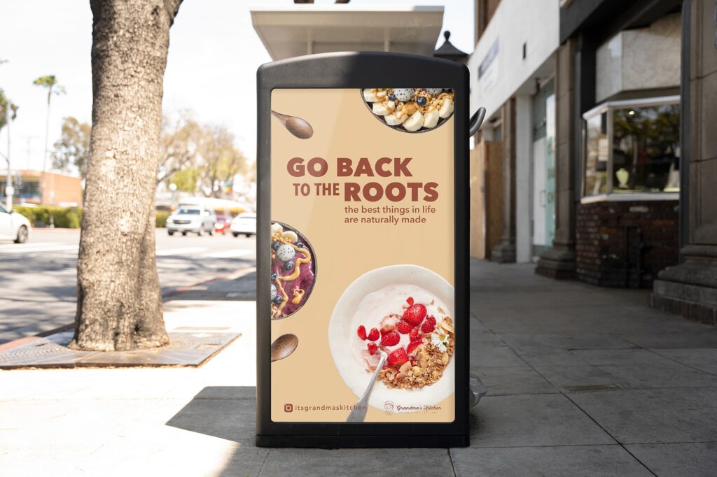
- Printed promotional materials (posters, cards, thank-you note)
- Instagram templates (posts and stories)
- Curated and retouched photography assets for brand use
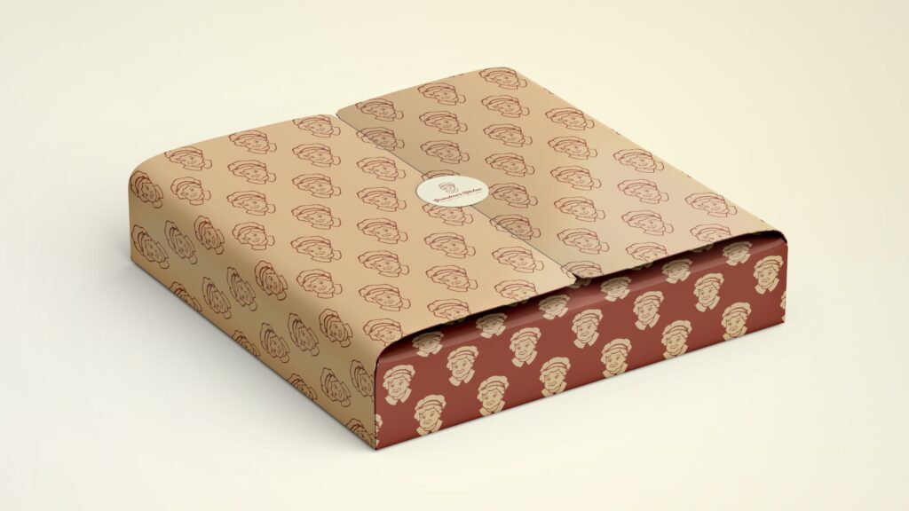
- Two box packaging designs
- One paper bag packaging design
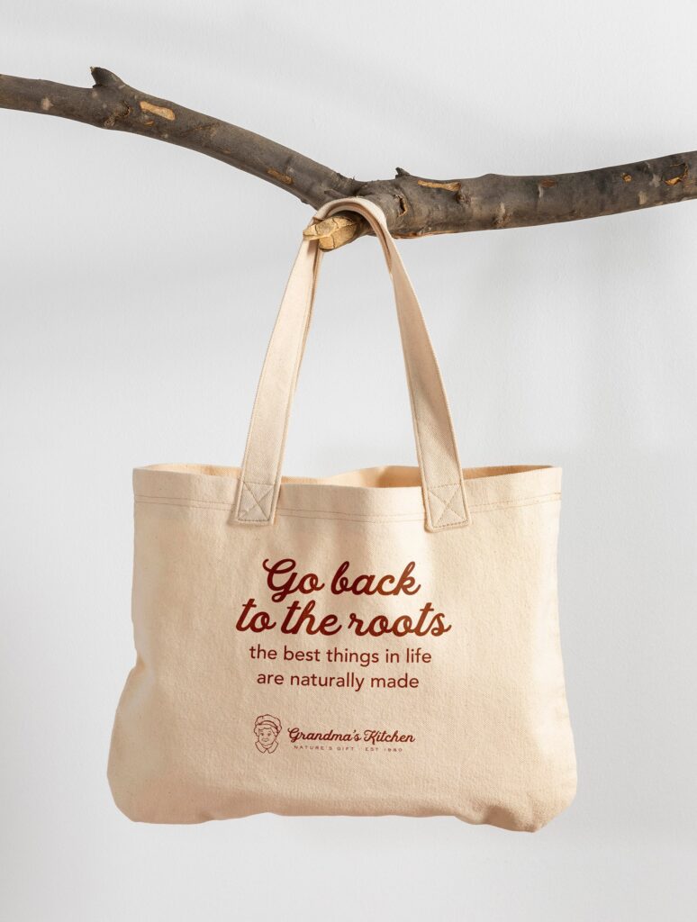
- One tote bag design
- Brand identity guidelines (PDF format)
